
issue n5
This week brings you:
A proud canister, super simple DIYs, a crazy comfy chair, WFH insights, and major color inspo!
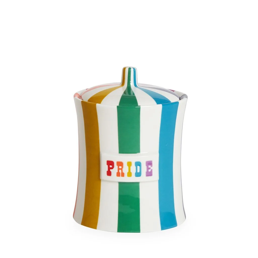
On sale: Jonathan Adler’s Pride Canister
This iconic canister from Jonathan Adler's Vice Collection is 25% off on Horchow. It's the perfect gift for yourself or a loved one (or both!) to show your pride and celebrate LGBTQ Month!
It's perfect for storing sugar, filling with your favorite candies, or hiding your secret stash ;-)

These 7 super simple projects can take your home to the next level. Unlike many DIY out there, these are actually so easy you'll regret not having done them before. She even included a couple of videos of herself doing them!
Also, #6 is a golden rule we should follow with EVERYTHING in our life.

Item of the Week: Moustache’s Bold Chair
Despite what it may look like, this chair by the people behind Big-Game Studio for the French brand Moustache is actually one of the most comfortables I've ever sat in. Not only that, but the cover is also removable so you can actually change its color if you ever get bored (as if!).
And if you need further convincing please know that they are displayed at the MoMa, the Gestaltung and the Musee des Arts Decoratifs permanent collections.

In this 3-min article by Laura Vanderham, we are given a few insights on why working from home should NOT try to replicate your office environment. We should instead focus on "consciously structure our workweek according to the benefits of each location."
In fact, by now we should all be familiar with what has been working best, or not, for us. With that in mind, try designating a work area (or two) in which you can enjoy the comfort of being at home, and maximize your productivity.
Oh, and don't forget to contact us if you need help setting up a dope WFH environment :-)

Chic Living: Flack Studio’s ‘New Fresh’
This Australian firm's projects are diverse in style and scope, but they all have a few things in common: They think outside the box and they're the perfect balance between classic elegance and modern 'laidbackness'.
On their projects, they school us with their use of soft and hard materials, and with a use of colors that don't automatically translate as fresh but do liven up the space in a cool, restrained, and highly creative way.
Being in Miami doesn't mean we need to take the 'beachy ambiance' so literally; we need to start thinking about using richer colors and say NO to the typical, and frankly dull, whites, and blues, and greys we see everywhere.
Aaand voilà for today. If you have any questions or comments, or if you came across something interesting you’d like to share, simply respond to this e-mail as I’d love to hear from you!
Until next week :-)
- C
*For cool inspo follow INTERIORED on Pinterest
*For daily content follow INTERIORED on Instagram
*For sporadic musings follow INTERIORED on Twitter
*We don’t really post much in there but you can still follow INTERIORED on Facebook